About Grivante

I am a 38yo Writer, Artist and by day salesman. I live, work and am learning to play in beautiful North Idaho. Each day is a new adventure and I am enjoying exploring all of the colors around me.

3rd Attempt – with Black Lily

This was the third piece I did. I primarily used the Black Lilly leaves here as well as the yellow from the Anthers.

20110818-015321.jpg

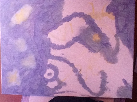
The coolest part of this piece was some of the shapes that happened accidentally, I added plenty of things on purpose, but a combination of swirls and a speck of debris left behind from the petals, gave what I see as part of a wolves face as well as part of a females face behind it. Check it out and let me know what you see.

20110818-015331.jpg

A different view of the same section.

20110818-015345.jpg

This part here was a close up of some of the swirls from the bottom left corner.

20110818-015359.jpg

All in all it wasn’t the look I was going for when I started but it was a great learning experience as to how the Black Lily behaved and some of the effects that could be created with it.

Pictures of some of the flowers used

I had a chance to take some pictures this morning.

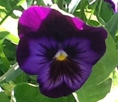
The first two are the purple and yellow Pansies I have been using to make most of my blues. This first image is very purple and the color it gives when wet is purple like the leaves, but dries various shades of blue. A week ago there was much more yellow in the throaat then there is today when I took these.

When using any of the Pansies they tend to leave a fair amount of debris, but if you wait about ten seconds for things to dry you can brush it off, if you wait more than a couple of minutes the debris will dry in to your painting, if that is the look you are going for, great, if you want to minimize the plant matter in your finished product you will want to stay on top of keeping it off.
20110818-122738.jpg

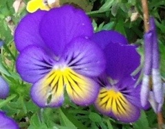
This is a slightly different colored Pansy that gives similar results.

20110818-122834.jpg

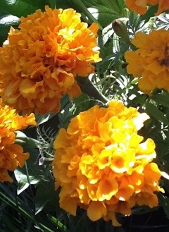
These orange Marigolds give a brilliant orange on thick stock paper, but tend to leave a lot of runny debris on canvas. They are ok to use first, or if you clear a spot to add it in, but they do not work to add on top of other colors.

20110818-122904.jpg

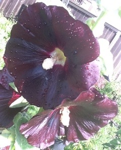
And the last image for the moment is the Black Hollyhock which by far gives the brightest purple I have found yet. Challenges with it include that it is very sticky to work with, it can wipe out previous layers if not careful and it will leave a lot of debris that is hard, if not impossible to remove.

20110818-122914.jpg

I’ll probably do a few posts on Hollyhocks in general because in addition to the vibrant purple I have also discovered something magical with White one’s that I was not expecting.

Painted tonight – Work in Proress

While I am trying to go chronologically until I get everything that I have done up until now down, I have had a few technical difficulties resulting in do-overs that I am not ready to go back and tackle as of yet.

So here is my work in progress. One of them anyway. I started this piece over the weekend, its the piece I have been meaning to get to since I did the first one and was inspired to play with the Pansies blue. It has of course gone in a different direction than I intended but I have a pretty cool vision for where it is going now.

Many of my stories go the same direction. They start with a cool idea but then the characters and other events take over and they end up somewhere near there, but also somewhere unexpected.

I only have the picture from the other day at the moment, I filled in the rest of the blue tonight and will probably do some more touch up tomorrow before going to the next layer. I will make an effort to get more shots, especially of the flowers I am using and the pages of the palette book, but it is hard to paint and lug(really, lug? like it’s so big) around an ipad and its technical stuff that just isn’t as fun when your are in the moment.

20110817-085350.jpg

We are shopping for Tulips online at the moment, something I did not get to use this year but have been daydreaming about since I started to get into this and remembered how vivid their colors had been this spring. Can’t wait. So far I have seen a beautiful black, purple, red and a nice yellow to play with. And their anthers…the yellow I saw is making me drool.

I think I smell Huckleberry Cobbler, it must be time to go…

2nd attempt- Starry Night with Black Lily

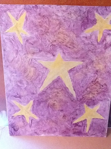
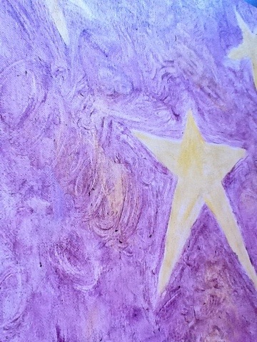
Though the black Hollyhock did cast the original demo piece in to chaos, it did inspire me to try something else. Though I didn’t actually end up using the Hollyhock on the next painting. This one is made entirely from the petals of a black Stargazer Lily and the yellow, the best yellow I have found thus far, from the pollen covering its anthers. Sadly, the ones in our yard have finished blooming for the year and taken their golden yellow with them.

The pollen carrier is pretty small, about the size of a large rice kernel, but produces a strong vibrant yellow and is great for going over other colors as it does not wash them away in its application.

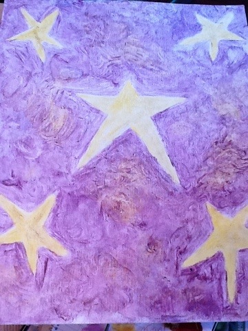
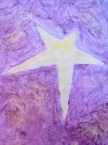
I set out with a pretty direct idea on this one, something I don’t normally do. Here is the full image, followed by a couple of close ups.

20110815-063851.jpg

20110815-063936.jpg

20110815-064102.jpg

20110815-064134.jpg

Color options

Today I set out to talk a little about colors. One of the funnest and most challenging things about painting with flowers is that you only have what nature gives you to work with. I am lucky to be blessed with a girlfriend with a rainbow colored thumb which provides a fair amount of options to explore. Plus if there is something I want more of or would like her to add, she is generally very accommodating because it shows I am also taking interest in the things she likes, albeit mine come from a direction, they both get us to the same place.

The only challenge thus far has been that she has a bit of an aversion to yellows and oranges, but luckily for me, she likes me, so there are a few floating around.

Although it would probably only be a misdemeanor, I reccommend not raiding your neighbors garden at least not without permission. Another option is to just go and buy plants or bouquets and come winter time I just might do the latter, but there is something special about knowing that the place you are taking from will give again next year.

Besides, I haven’t yet been thrown out by security, but I have gotten more than one strange look as we wander around a nursery and I take a petal or two from various plants and stick them in my pocket…

You can also look in public spaces for many different options you may not have at home quite yet. Parks, playgrounds, office buildings etc all have landscaping from which to try a few, take sparingly or ask for permission first.

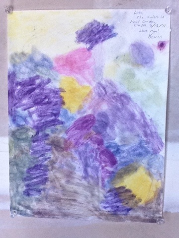
Here is a sample of the colors I found in Lisa’s garden this weekend, omitting green of course. This was done on some thick sketchbook paper which as close as I can tell behaves like watercolor paper. Some of the colors are quite a bit different then on canvas.

20110815-053824.jpg

One tip for colors in the wild. Either have a canvas or your palette book handy in order to put the petals to use. Most don’t hold up to waiting for very long and while sometimes a dryer flower will give you different results, a too dry flower will give you nothing at all and then the gift is wasted.

Have a camera available as well unless you are a master gardener or a botanist as trying to identify a flower later might be hard to do if you wanted to use it again.

Bring plastic bags with you and store the petals in one until you get home to use them. They will not dry out anywhere near as quick and though I haven’t tried it yet, placing them in the fridge might preserve them a little longer.

Best choice of all though might be to just bring your canvas with you and see what you can create with what you are given.

Black Hollyhock – Sticky Purple

When Lisa brought me a leaf from her just in bloom black Hollyhock, I quickly tried it on the nearest piece of paper I could find and discovered it to be the most vibrant purple I had seen yet and I had discovered a lot of purples in the garden.

It is very sticky to work with and can leave a faint purple color or a deep rich purple that can over power in certain situations. Use it to pop or with other strong colors. It does leave behind a fair amount of debris.

I unfortunately put it on to the original sample canvas and found that it was a bit too much compared to what was already on there. At present I haven’t quite decided what if anything to do with it now.

20110815-060630.jpg

Why Scrye?

So, why Scrye?

I wanted to find a name for what I was doing. I figured while it wasn’t likely a medium which an artist would likely use to paint with, with all of today’s modern choices, at the very least native americans and our ancestors used some form of plant matter to make the colors in their paintings. The closest I found in my few searches were related to using plants as dyes, which is essentially the same, but not entirely.

While some of the same colors are probably found in the plants they used, they are not strictly speaking devised in the same way. For me, extraction of the color comes from taking the petals, leaves, stamens or other parts and rubbing them against the canvas itself to bring out whatever color is on or inside the plant. There are many and there will probably be tons of posts covering this that and everything else regarding to some of the more interesting flowers and or colors I have found and how they come out on different substrates, but for now, let’s just leave it at many.

When you first start rubbing a petal against canvas, you will find that it leaves behind color, moisture and often times debris. It was after trying many different flowers that I realized each one behaved differently, some were dry(leaves of plants and pollens), others were very moist and came off runny(berries especially), some left behind debris which could be bothersome, others were sticky and hard to work with and some dry a completely different color than they start. Here is a good point to mention that many flowers do not give the same color as they appear and often times they can give more than one and other parts might give something else entirely, just like the yellow pollen from the Anther of a Black Lily.

I set out to make a classification system so that I could keep track of which did what and make sure that I did not use some of the more bothersome ones and accidentally ruin what I was working on.

And from that, the name was born.

As of this writing, the letters mean the following things

S – Scented, gives off an odor that may hopefully last after the material has dried.
C – Crumbly, leaves debris, can sometimes be brushed away with your hand, but may be bothersome.
R – Runny or potentially too moist, can also be sticky
Y – Leaf is dry, may require extra effort to get to the color
E – This one had a meaning, but I have since combined it with R, so for now it is just a place holder, until I determine the need for another descriptor.

D – Dries a different color than when it is wet
+ – Requires a lot of material to make swatch of color
– – Requires only a little to make a swatch of color

What is Scrye Dye?

It may go by another name, or perhaps many, but I couldn’t find anything that really fit it, so in trying to identify a categorization system I also found a name. More on that another time. For now, I want to take a moment to describe exactly what it is.

By Dictionary.com’s definition, to Scrye(or as they spell it, Scry), “Foretell the future using a crystal ball or other reflective object or surface.”

In a way, I would like to think this is much the same, but instead what we are doing is dipping our heads deep through the surface of the flow and experiencing creativity, divinity and just a bit of peace.

For me, to Scrye is to paint with flowers.

Now looking that up on-line leads to many results, but none that I could find that were anything like what I was doing. They all involved placing dried leaves into a painting or using leaves and branches to make a pattern or as a brush.

No, what I meant was actually painting with flowers.

I started by raiding Lisa’s garden, with her permission of course, egads if I hadn’t, though she does keep a close eye on me, lol…you’ll understand why soon enough.

I plucked a petal from something, I don’t recall what it was, and started smearing it on an old hard piece of canvas I had bought at a yard sale this summer. I believe it left a purple smear. While having played with oil paints this summer I had discovered at least, that medium, blended in most interesting ways. Why not the colors from a flowers petals, leaves and other parts?

Before you know it, I was begging Lisa to bring me flowers from all around, smearing them, making mental notes and then moving on. I soon did what I always do and started too make sense of the chaos before me, even though it is the chaos that I most wanted to paint.

Once caught up in the moment, I joined the flow and explored. The first results are somewhere nearby, maybe even posted below, nothing exciting, somewhat mediocre really, but I could see there was potential.

20110814-061221.jpg

From there I did a couple of somewhat random paintings with the flowers I had liked best from my first experiments and although it was pale, the results, swirls of color, were enchanting.

Next I started a couple of different attempts at making a palette book, I am using a paper one now, but really need to get a book of canvas pages to do it right. Every petal behaves differently depending on the substrate it is applied to. It was during the palette book stage that I needed a system of classification and thereby stumbled across the name I would come to call it.